Dynami
Project at a glance
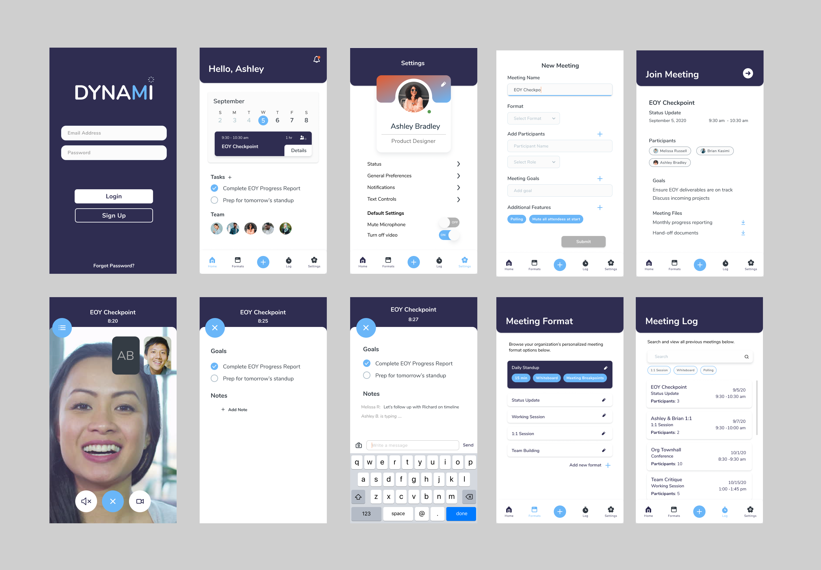
Final design concept for Dynami
Overview
Dynami is a video conferencing app designed to help remote teams actually get things done together. By bringing productivity tools directly into the call, Dynami bridges the gap between simple video chat and active project collaboration.
How it started
Context
During the pandemic, video calls quickly became the default for everything. This 6-week project with Shape/Build was an opportunity to explore how we could make remote meetings feel less tiring and much more interactive.
Problem statement
"While video calls help us talk face-to-face, sharing information usually feels clunky and disconnected. How can we build a meeting experience that encourages genuine team collaboration?"
Research & Key themes
Discovery
Talked with people navigating remote work and learning to uncover what was making virtual meetings feel so exhausting.
Pain points
Users constantly felt fatigue from switching between apps, struggled to share quick non-verbal feedback, and lacked good follow-up tools once calls ended.
Core needs
The biggest goal was bringing useful tools into one place so teams could stay focused without interrupting the conversation flow.
Potential solutions
Roles & feedback
Set up clear meeting formats and user roles to organize calls, alongside expressive reaction features so people can engage naturally.
Friction control
Added a response queue so participants don't talk over one another, plus background noise filters to keep discussions clear.
Integrated ecosystem
Built shared file hubs and persistent workspaces directly into the interface so information stays accessible after the call.
Process: Sketching to mockup
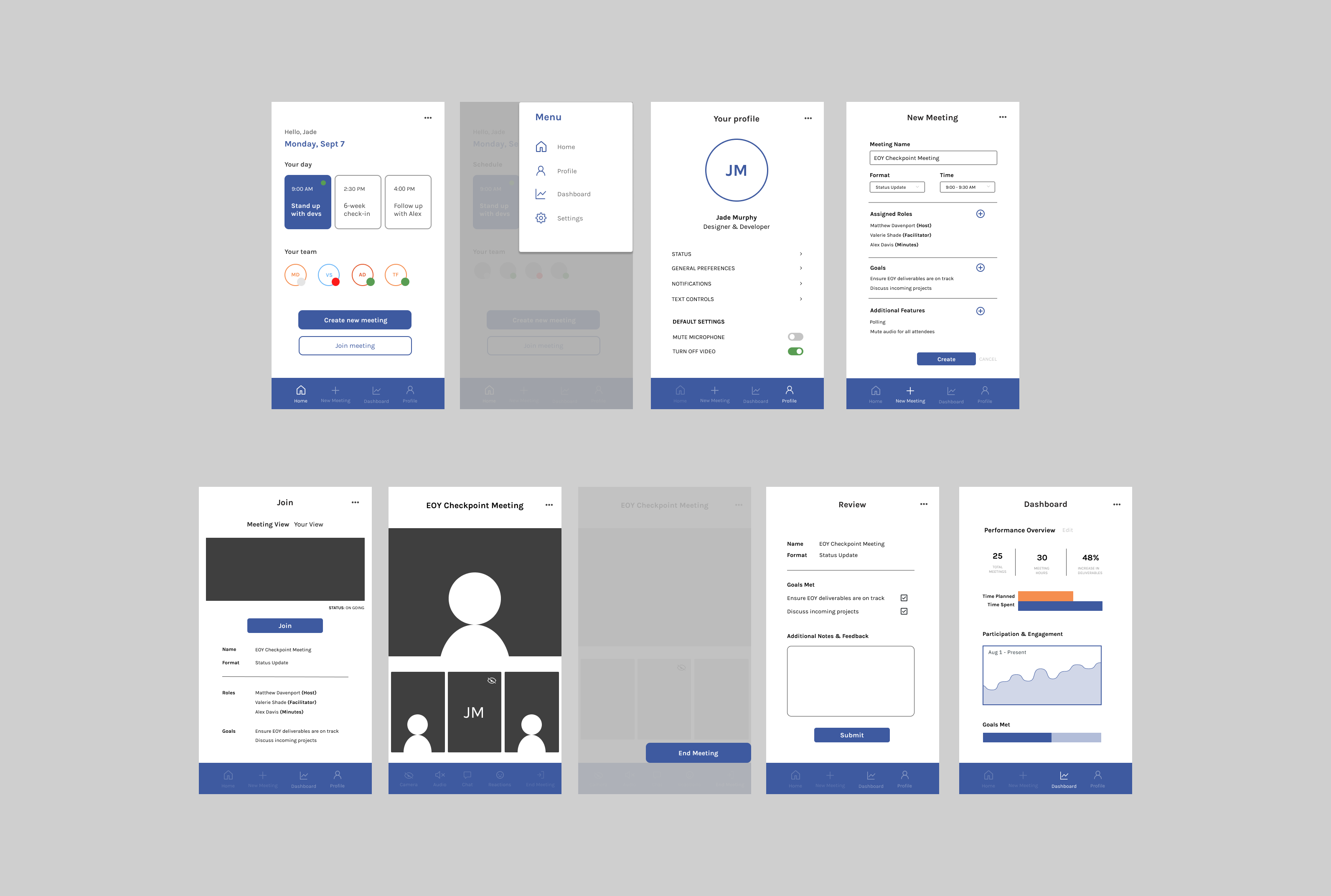
After mapping out research insights, I sketched high-level user journeys and built quick digital mockups to figure out the most natural layout for app navigation.
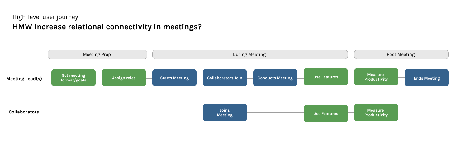
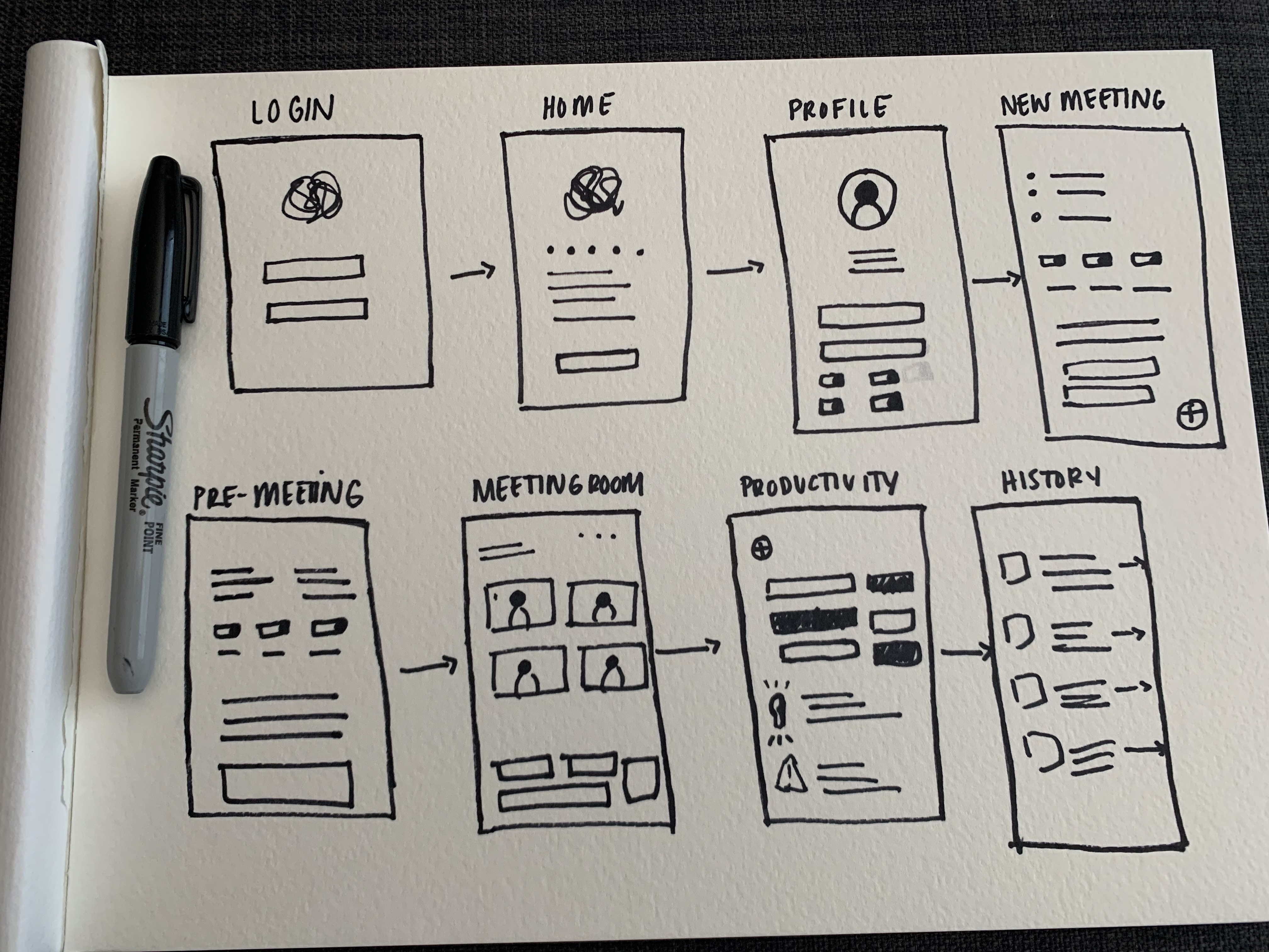
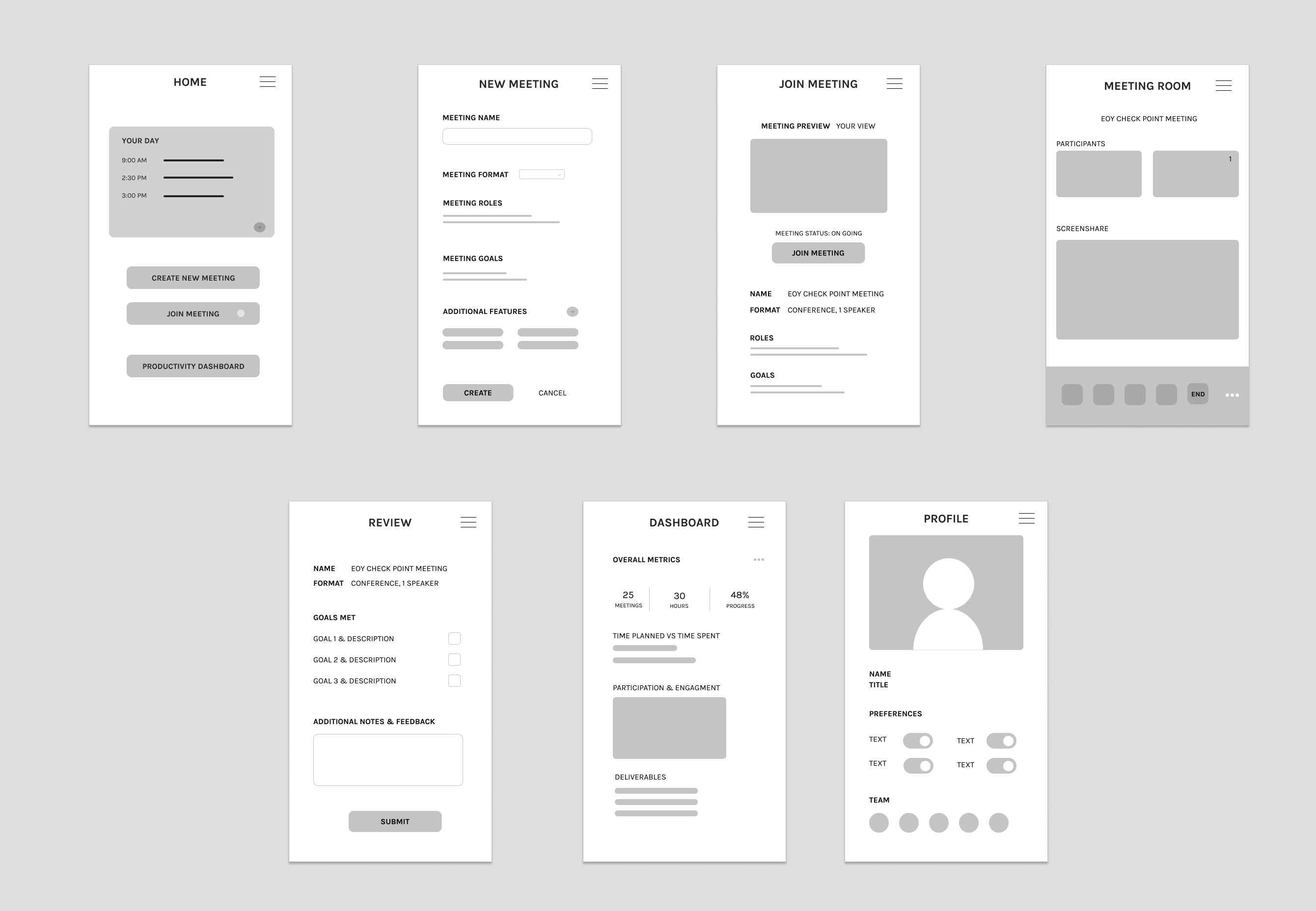
The evolution from initial journey mapping to lofi digital mockups.
Visual design
I chose a deep purple palette paired with warm light blue and orange accents to create a space that feels professional yet welcoming. The dark purple offers a comfortable, dark-mode feel without looking overly corporate.
To keep things friendly and easy to read, I paired the palette with Nunito—a typeface whose rounded edges give the app an approachable, modern feel.
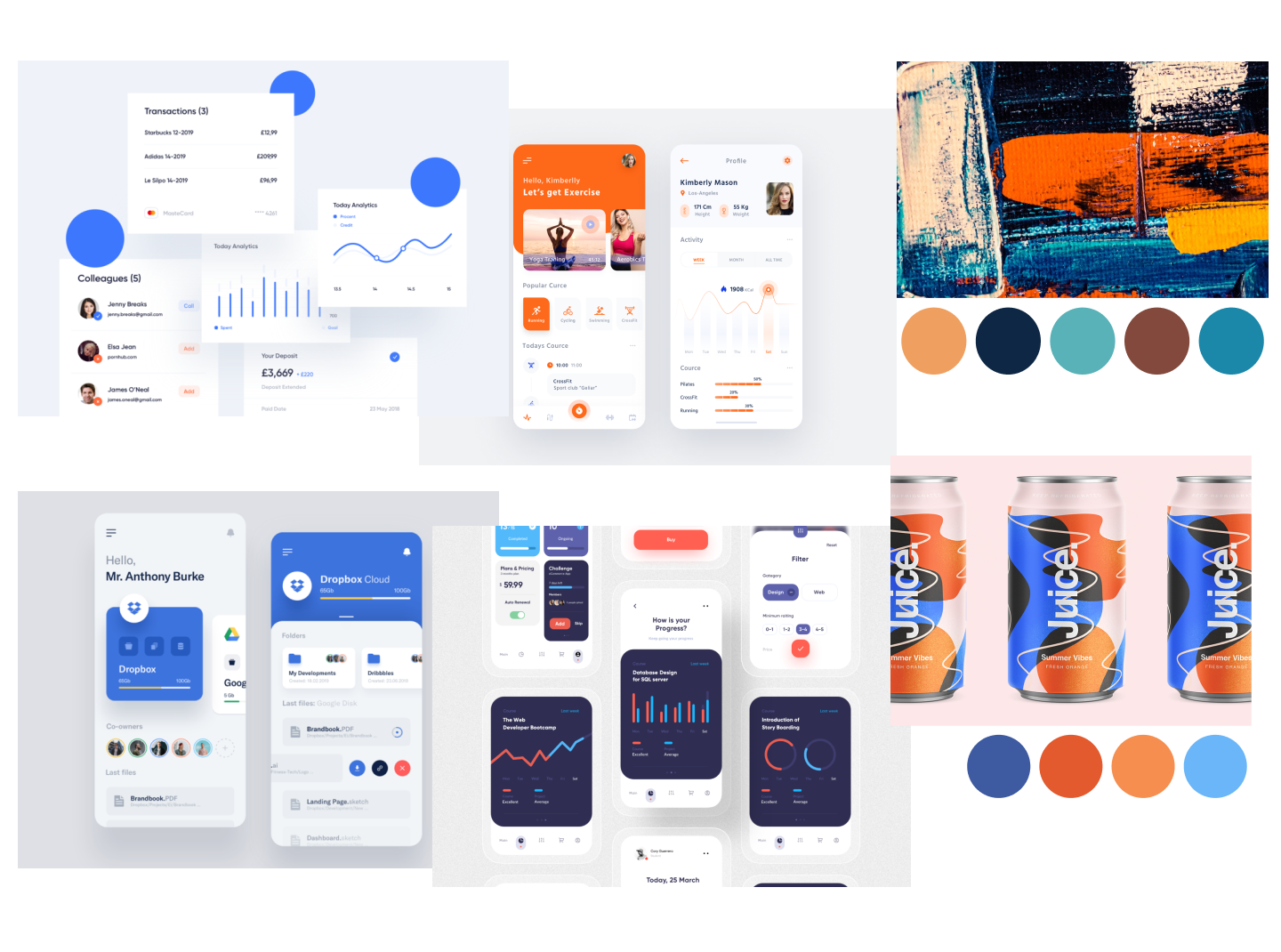
First iteration: Integrating the visual design system
Final thoughts & takeaways
I originally started this project trying to improve on traditional video call formats. Halfway through, I realized that looking only at video apps was limiting. When I broadened my focus to include note-taking and deep-work tools, the design really clicked—helping me build a more versatile workspace for teams.
Refinement
Narrowing our core focus mid-project helped sharpen the user experience and made the product's value much clearer.
Context
Designing for mobile was a great exercise, but research showed that desktop remains where people do their heavy collaborative work.
Research-led
Revisiting our early interview notes during the mid-project pivot kept the solution anchored in real human needs.